Hi everybody ?
We continue to discover for you. Our container factory on today’s tour is from South Korea.
Text description provided by the architects.
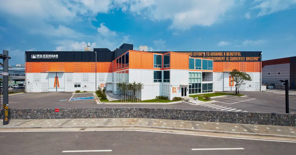
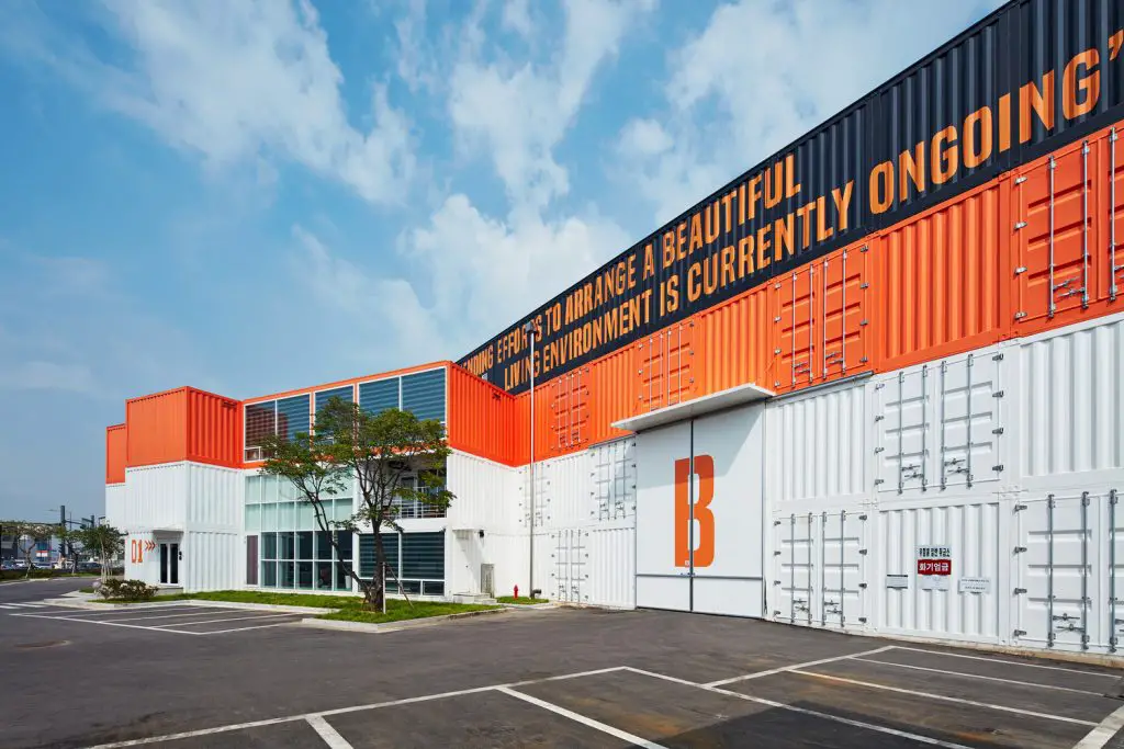
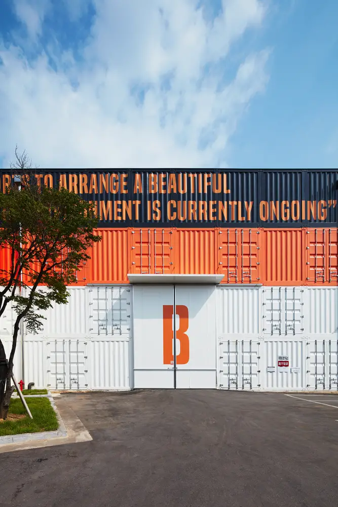
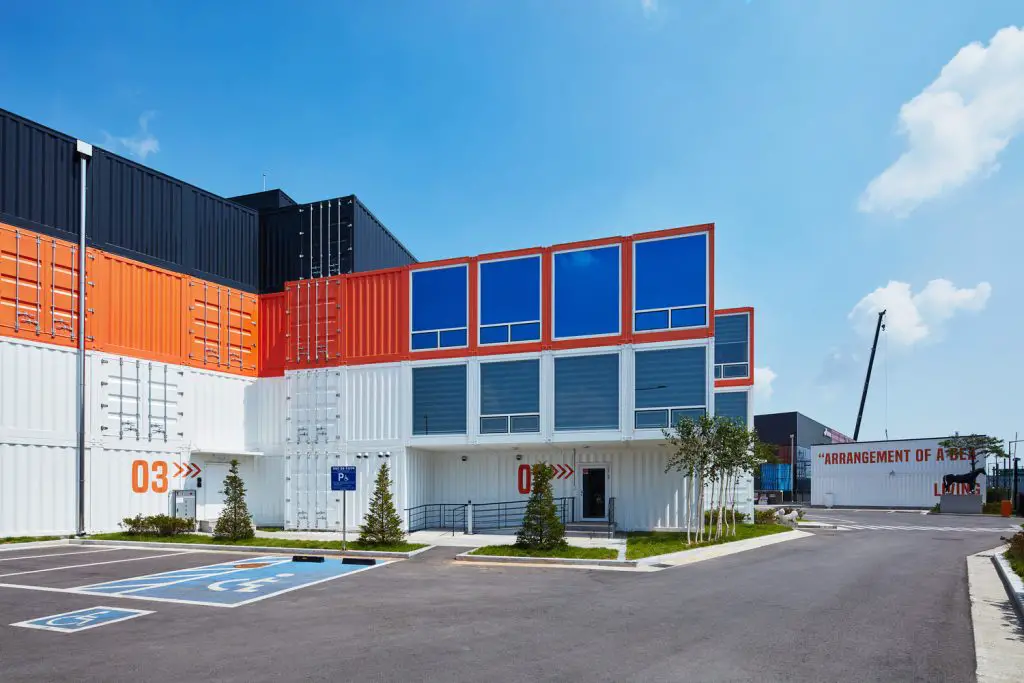
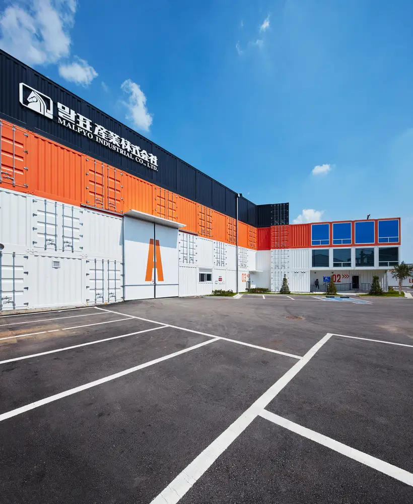
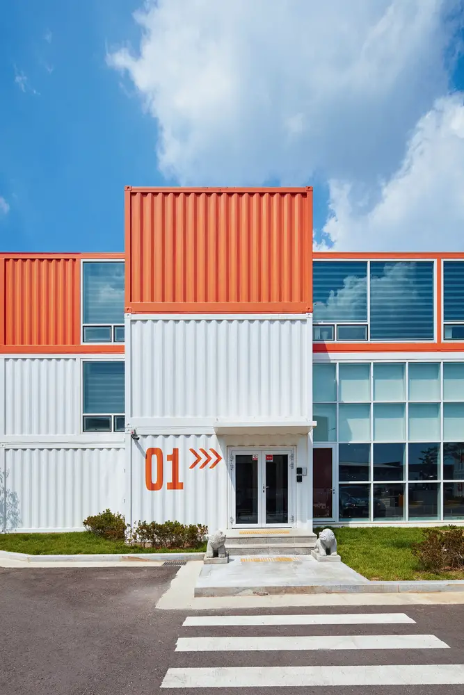
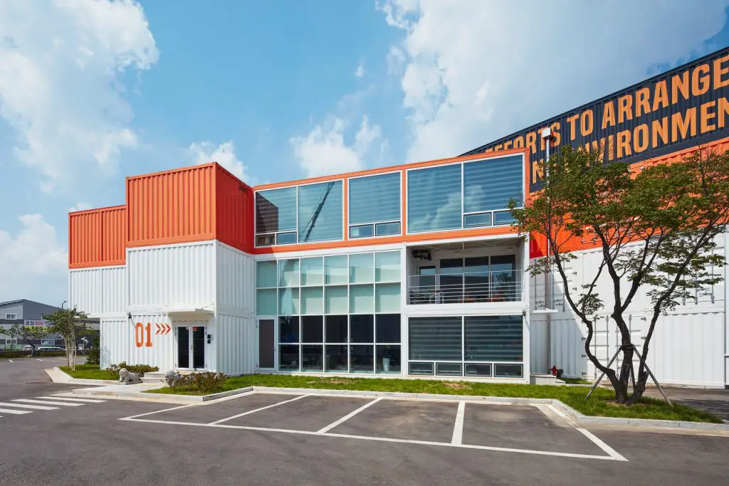
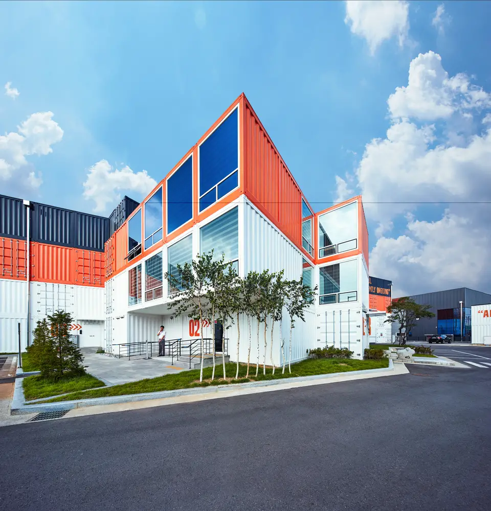
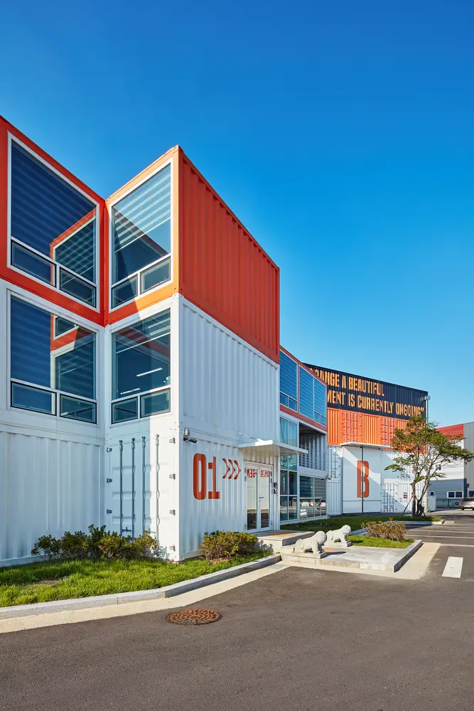
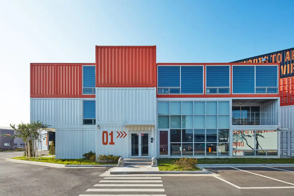
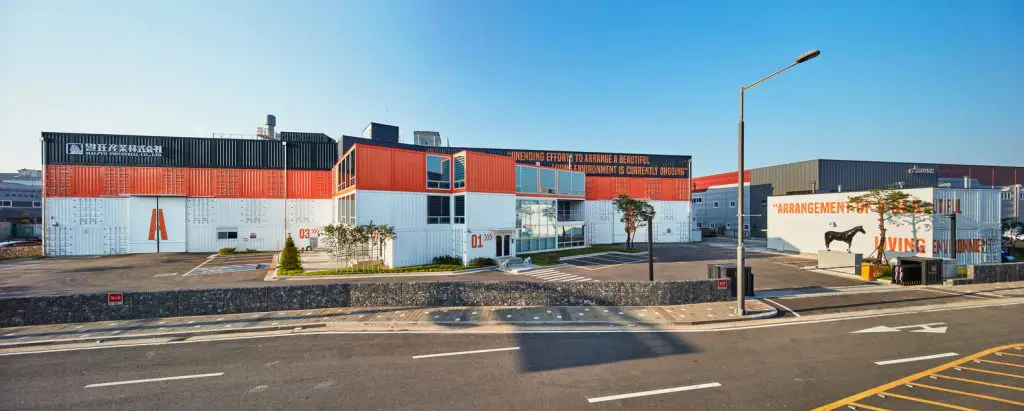
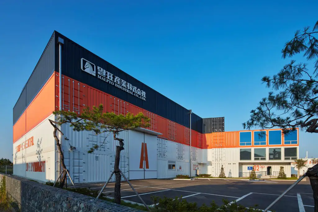
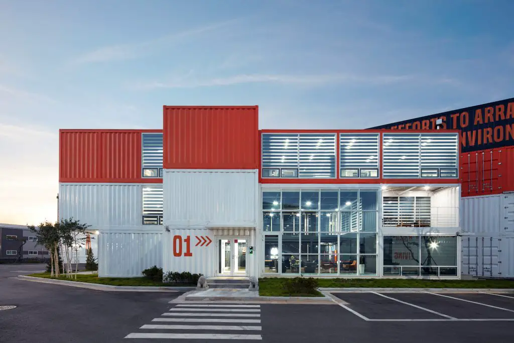
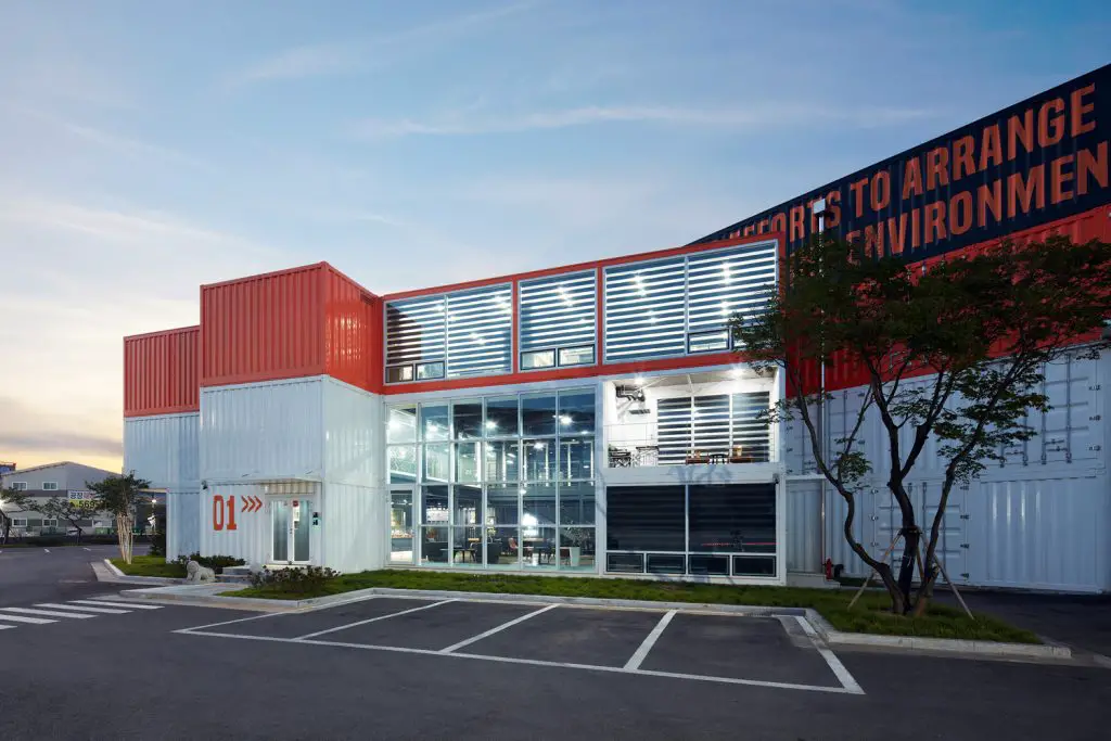
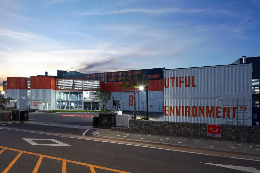
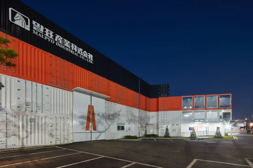
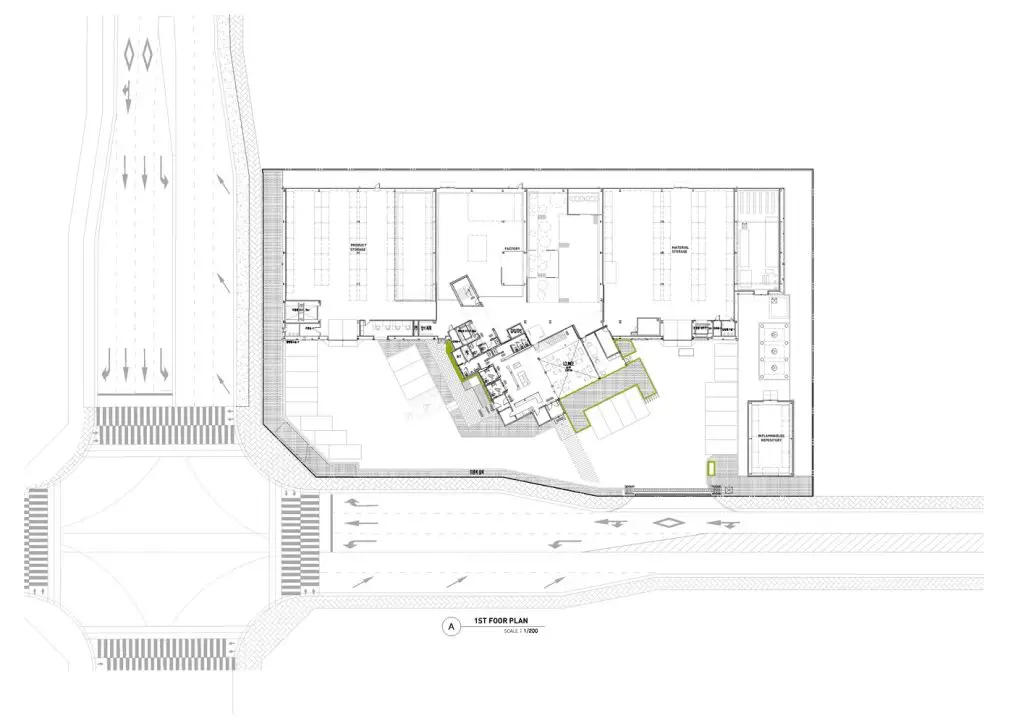
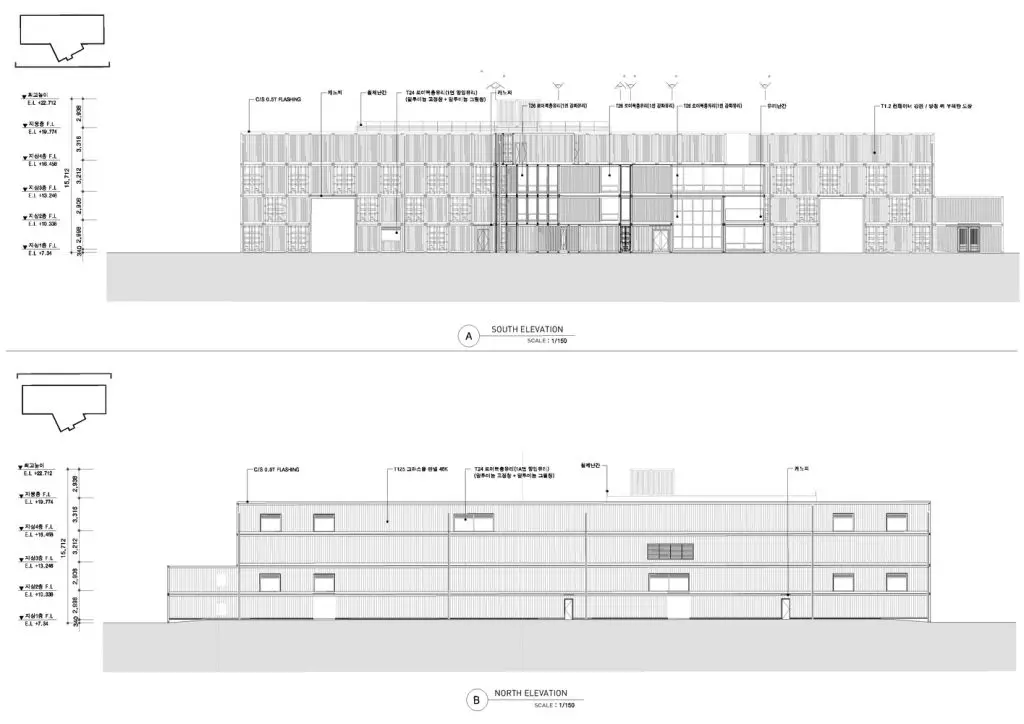
Malpyo, a family business with a long history spanning over three generations, is expanding into the cosmetics sector. URBANTAINER’s mission is to capture the spirit of the company’s transition to a modern and trend-oriented brand with the new company headquarter. The starting point for the design concept was to overcome the literal notion of a factory as a place of production by creating a space that symbolically carries the energy of the company’s new brand identity, by effectively utilising shipping containers in emotion-evoking colours. Malpyo’s new headquarter consists of two parts, the office area and the production facilities. In order to create an efficiently built space with a unique character, the office area was built with shipping containers.
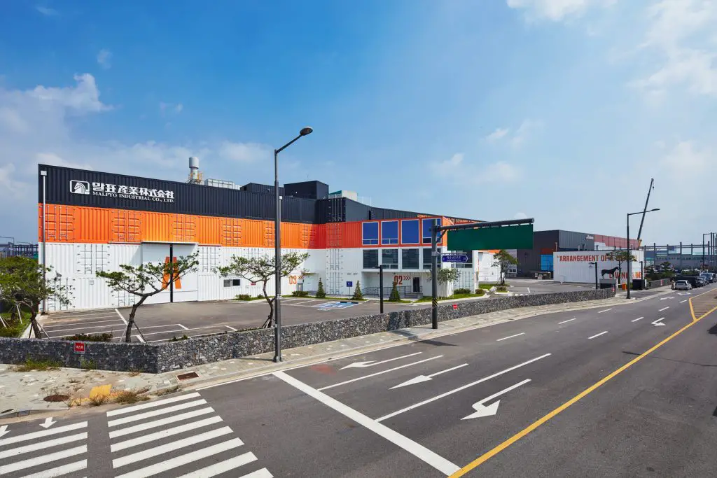
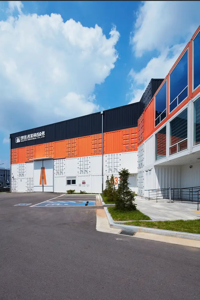
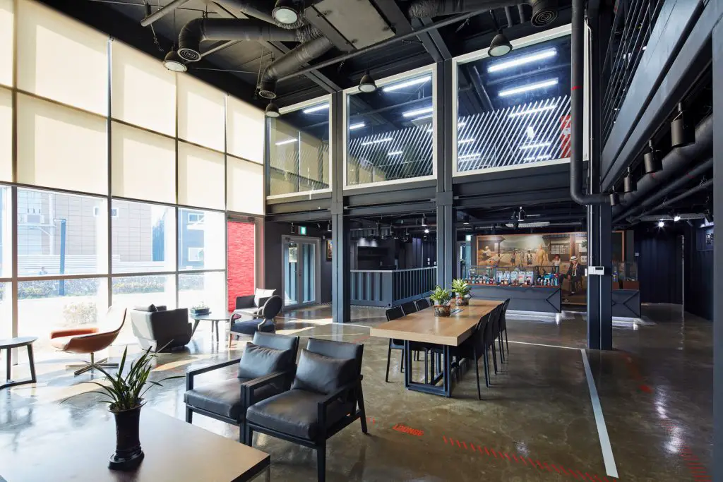
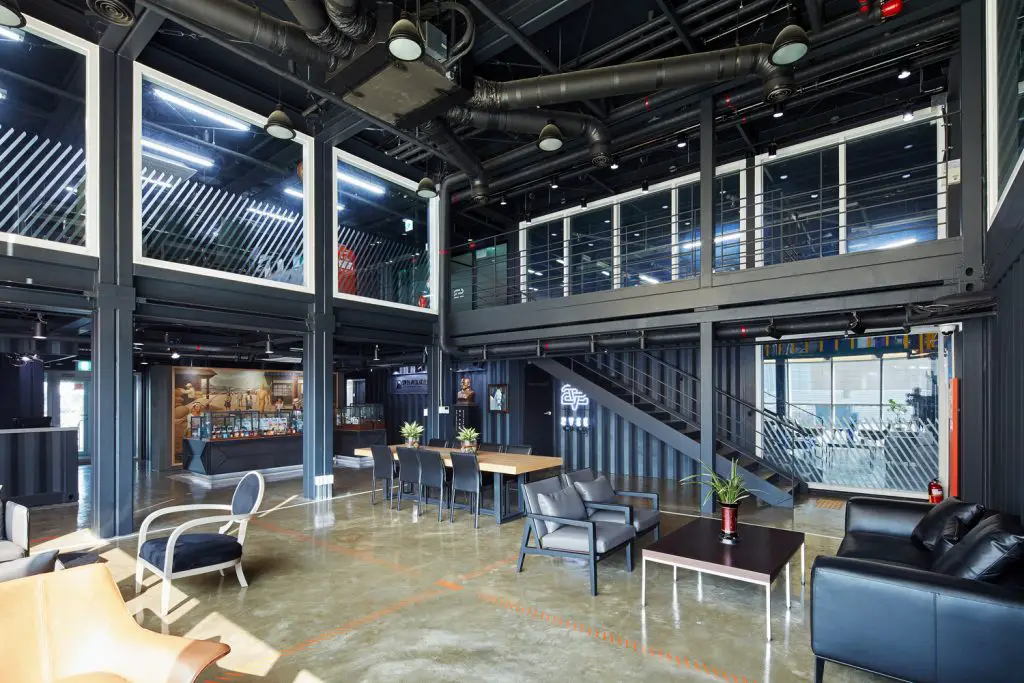
Due to its large scale, the production facilities are based on a steel-frame structure, coated with container skin. What makes this building unique is the arrangement of the two parts–the office area is angled as if it diagonally protruded from he the production hall. Before the redesign, the factory was a typical production, completely shielded to the outside world, and with a clear separation between office space and production area. In this setup, machinery served the sole purpose of manufacturing goods. An important part of URBANTAINER’s design strategy is aimed at breaking up this dichotomy. The separating wall between the office and production areas is made of glass and provides a transparent view from the office to the factory and vice versa.
The machinery now becomes part of the interior design of the space. All procedures that make up the heart of the factory, from manufacturing to logistics, are made visible and become a crucial part of communicating the brand essence to visitors. The design also extends to the functional dimension of the production process. In order to maximize production efficiency, the space layout now accommodates the flow of the complete production chain from arriving raw materials to manufacturing to the finished product by taking into account workers’ movements and optimising space utilisation. With the new design layout, separate delivery and loading zones for the raw materials and the finished product section guarantee a smooth un-interrupted workflow.
Another point of optimization for the workers is the addition of direct access to their rest facilities to cut unnecessary passages. One early challenge for the construction of the Malpyo headquarter building was the characteristic position of the building. While located between a main and a side street, access from the main road was not possible due to local traffic regulations. The resulting necessary detour to access the building from the side street and confusing facade alignment presented an enormous inconvenience for visitors. This problem was solved by aligning the building mass along a steep diagonal axis which opens up the facade view from the main road, allowing visitors to instantaneously find easy access to the main entrance.
- Architects – URBANTAINER
- Location – Hagun-ri, Yangchon-eup, Gimpo-si, Gyeonggi-do, South Korea
- Category – Factory
- Architecture Design – Jiwon Baik, Jungsic Kwon, Jihae Ock
- Interior Design – Donhee Yoon, Dongwook Kim
- Area – 4797.07 m2
- Project Year – 2017
- Photographs – Seungbok Lee
Living in a Container explores projects made with shipping containers around the world and shares them for you.
Don’t forget to take a look at the structures made with other amazing shipping containers on our site!
We invite you to send in your story and container homes photos too so we can re-share and inspire others towards a simple life too. Thank you!
You can share this using the link and social media re-share buttons below. Thanks!
» Follow Living in a Container on Social Media for regular shipping container house updates here «
