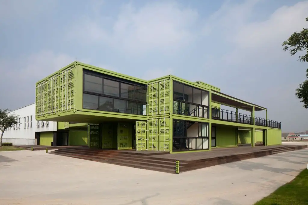
Tony’s Farm is the largest organic food farm in Shanghai , which produces OFDC certified fruits and vegetables. But the building is intended to be more than a place for the production of vegetables. The vision is to integrate consumers and therefore promote a natural lifestyle.
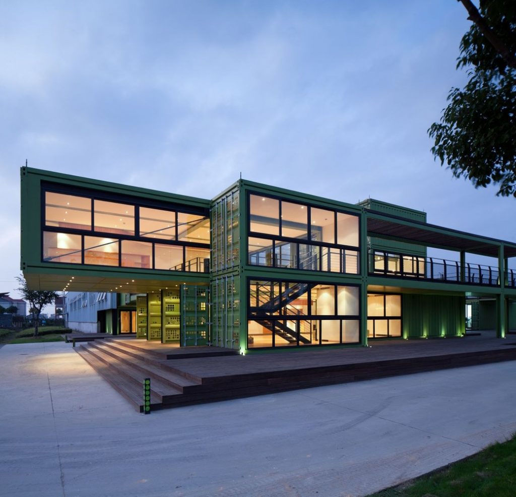
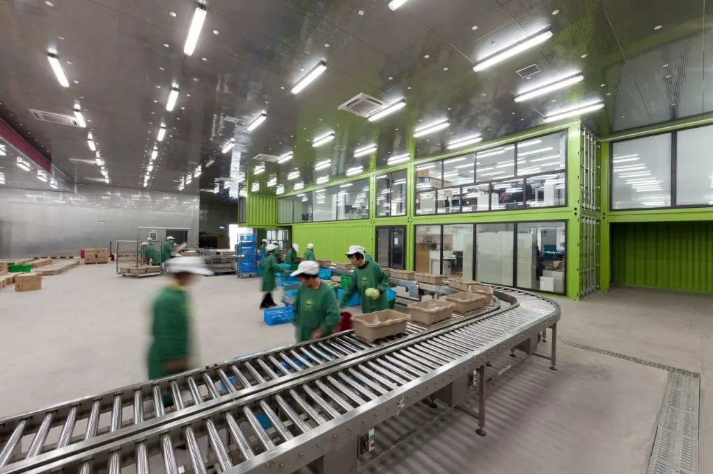
In order to link the activities of the workers with the visitors of the farm, Playze has developed a complex of buildings that combines the main reception, a VIP area and a future hotel with the new offices and an existing warehouse, which is filled with fruits and vegetables. The building offers transparency in the manufacturing process, therefore, it supports the vision of integrating the visitor and helps strengthen consumer confidence in farm products. At the same time, the design of the building is driven by the concept of sustainability, which together with its iconic qualities, communicates and promotes the central concept of the farm.
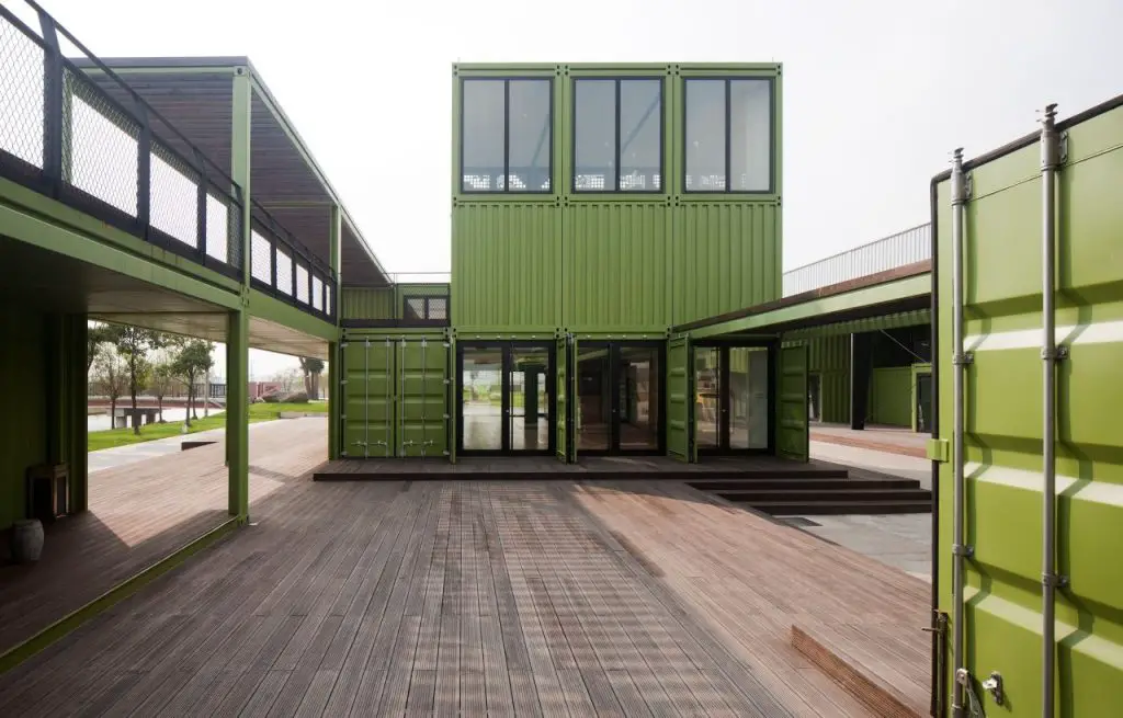
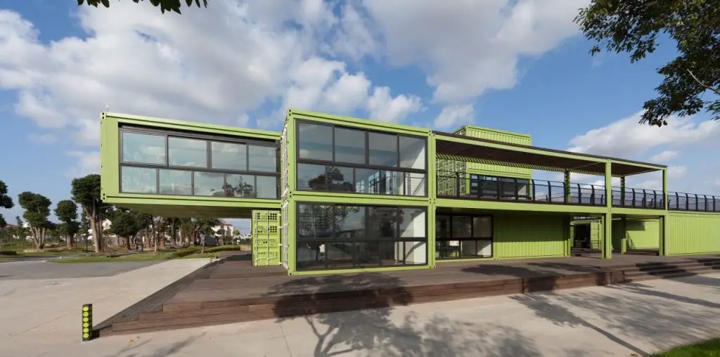
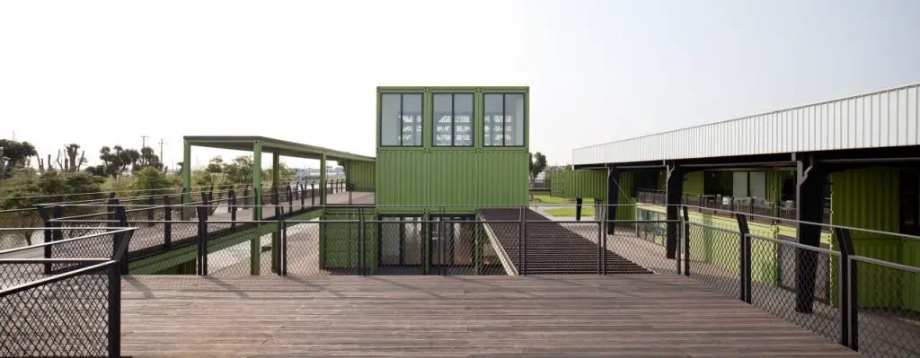
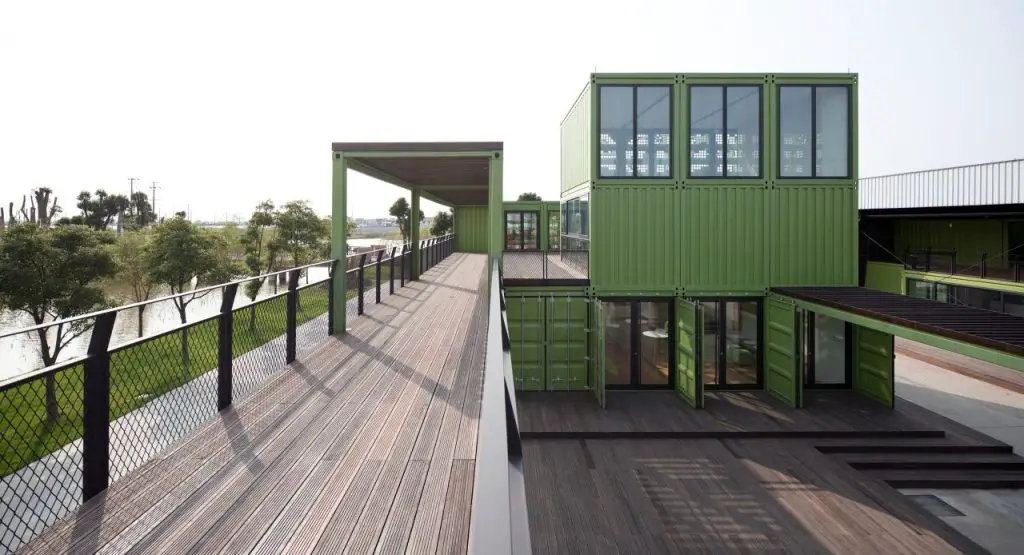
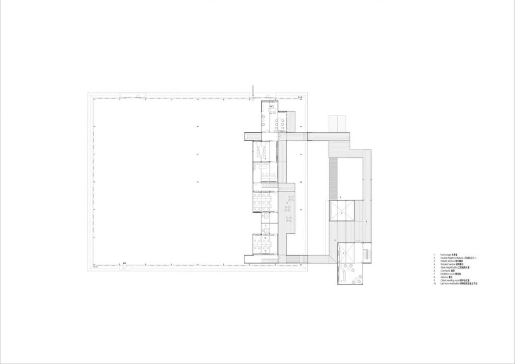
The building has been designed as a continuous spatial sequence in order to physically and visually connect the interior and the various exterior programs. The entire structure requires an exploration by visitors. When crossing the building, it is not obvious how the spatial sequence develops. A terrace system not only functions as a transitory space, but also as an extension of interior work and leisure areas. Outdoor meetings and other support activities can be done literally in the middle of nature.
Throughout the project, the immediate spatial relationship between the building and the environment is intended to create a virtual dialogue between the industrial aspects of food production and the surrounding farmland. The mass strategy supports this ambiguity by creating different types of visual relationships.
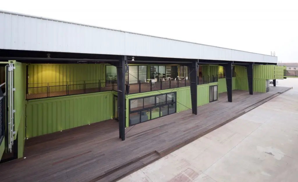
The systemic nature of the containers is offset by the adaptation to specific situations, such as the entrance, the patio, the office wing, the terraces, etc. The different orientations towards the landscape of the farm, the functional requirements and the spatial sequence define each situation in a specific way, although the spatial framework is the container with its standard dimensions.
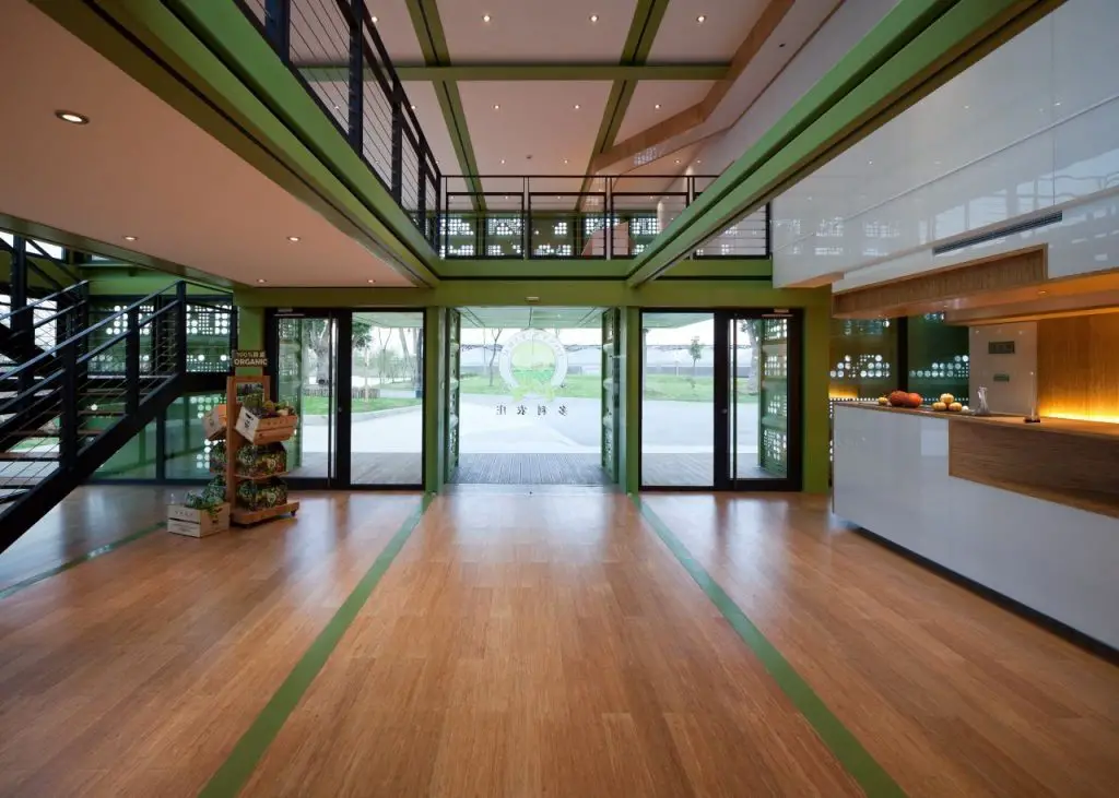
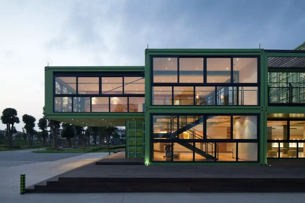
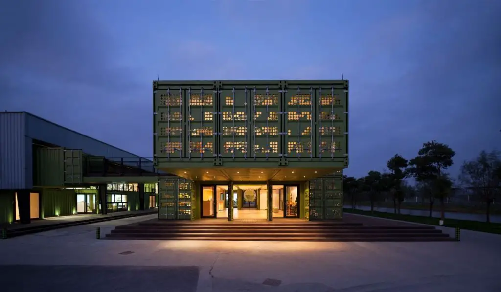
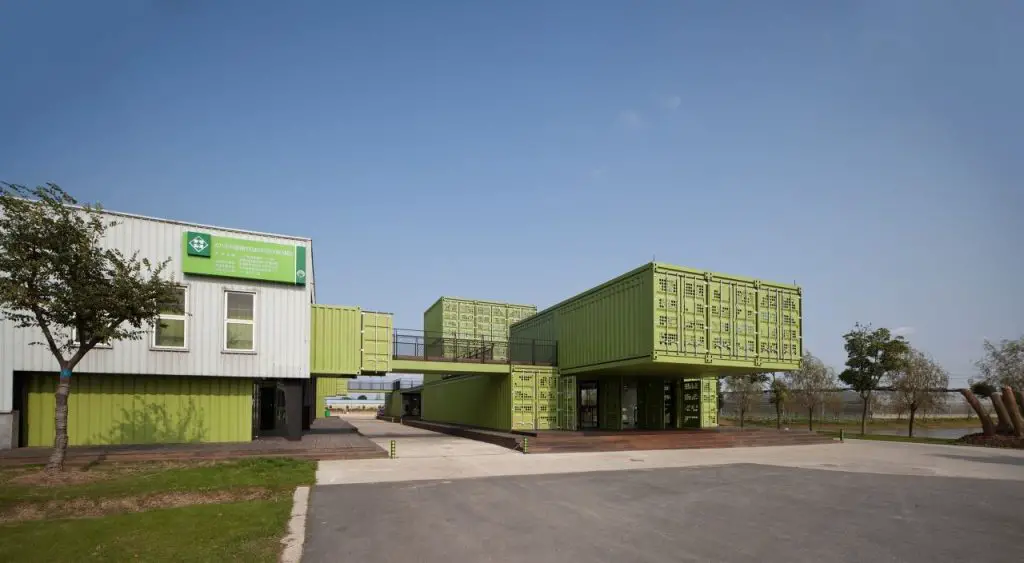
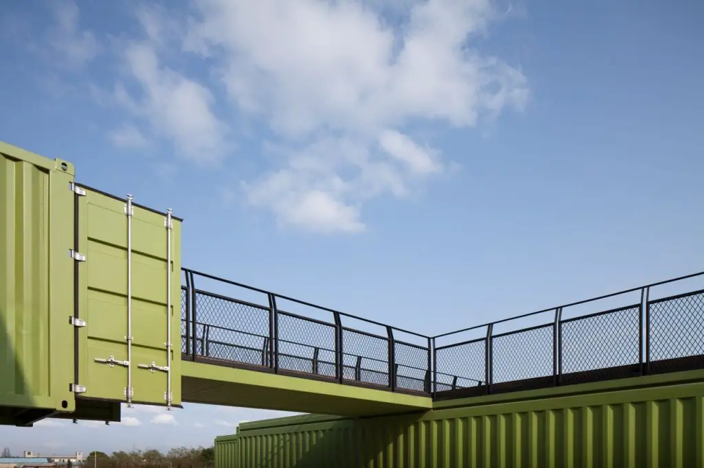
The cantilever gesture marks the main entrance to the site. This is where visitors enter the structure and find the reception desk. After the lobby, which is accentuated by a volume of 3 stories high, you go to an inner courtyard, where visitors are picked up by electric cars that take them to their hotel rooms, distributed along the farm.
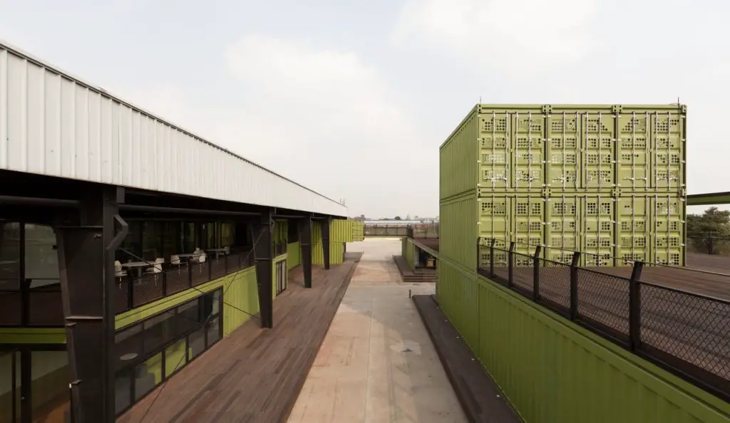
The second level allows a connection to the building’s office wing through 2 bridges. This part of the building complex is covered by the existing warehouse. The east facade has been cut, so offices can find shelter under the existing roof and form a new interior facade towards the production hall.
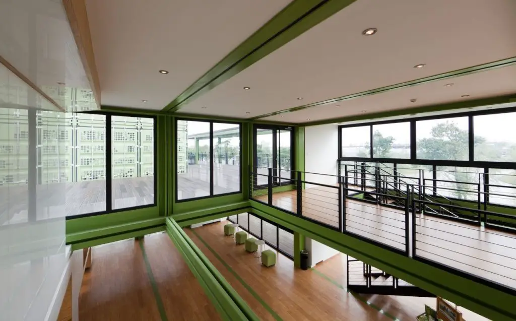
Because the climatic requirement called for impermeability and insulation, numerous specific details were developed to maintain the strict appearance of the containers. The elaborated details, for example the steel beams still visible from the containers inside, are in contrast to the raw tectonic details of the cargo container. In addition, the modular system was challenged by individual joints, resulting from irregular distribution of containers.
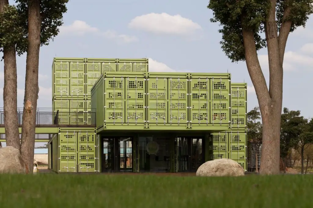
The structural logic of the container is the framed picture, which can be opened or closed in its 6 orientations. This characteristic was amplified in different spatial situations, integrated within the entire structure. In the input situation, for example, the additional support structure is reduced to a minimum to underline the “floating” state of the containers. The vertical 3-level space opens on 3 sides to dissolve the box. In the courtyard, the terraces form a roof down and cite the typology of the Chinese courtyard, while the social part is developed in the style of a constellation of slabs and pillars.
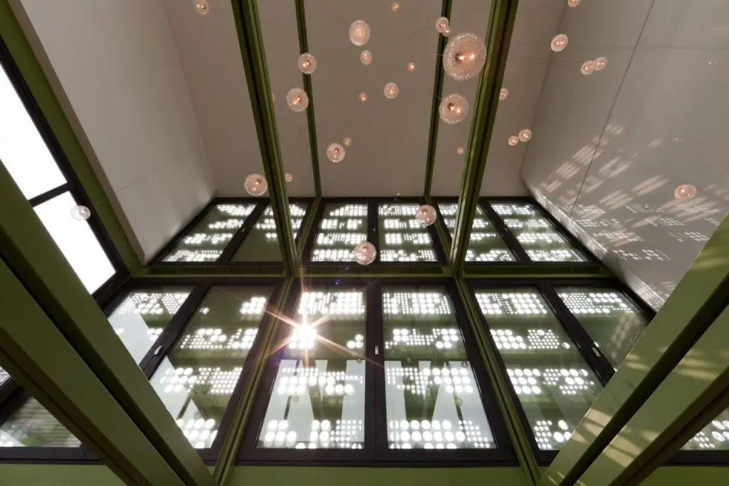
In order to cope with the client’s high aspirations regarding environmental protection, several strategies have been used to reduce the energy consumption of the building. The entire structure is well insulated, although the containers appear in their raw form. The doors of the original containers have been perforated and serve as shade curtains on the exterior facades exposed to the sun to minimize solar heat gain. A geothermal heat pump provides energy for air conditioning and underfloor heating systems. Controlled ventilation helps optimize air exchange rates and therefore to minimize energy loss through controlled aeration. The use of LED lighting reduces electricity consumption in general.
Another ambition of the project is to reduce the hidden energy in building materials, the so-called gray energy. Therefore recycled, ecologically sustainable or fast-growing materials were used. The reuse of cargo containers seemed appropriate, first because of its inherent structural autarchy and second because it is a common metaphor for “recycled space.” In addition, the minimum weight of the container structure allows the existing foundation plate to be reused. Bamboo wood was used for some interior and exterior floors, as well as in all integrated furniture.
Living in a Container explores projects made with shipping containers around the world and shares them for you.
Don’t forget to take a look at the structures made with other amazing shipping containers on our site!
We invite you to send in your story and container homes photos too so we can re-share and inspire others towards a simple life too. Thank you!
You can share this using the link and social media re-share buttons below. Thanks!
» Follow Living in a Container on Social Media for regular shipping container house updates here «
